
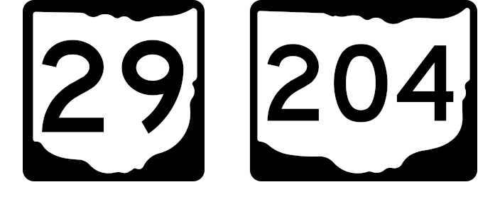
What exactly is the shape used on signs for state routes in Ohio? Obviously, it's the shape of the state itself — but, as it turns out, not quite. On closer inspection, there are usually noticeable differences between the shape of the geographical State Of Ohio and the shape used in route markers. On yet closer inspection still, there are often minor differences between the shapes used on different route marker signs. So how is this shape defined, for the purposes of manufacturing signs?
That's not immediately clear to everyone. The Ohio Manual of Uniform Traffic Control Devices for Streets and Highways offers the following: “State Route signs shall consist of black numerals on a white representation of the State of Ohio surrounded by a black background without a border. A design detail is provided in the SDM (see Section 1A.11).” The referenced section does not directly include a design detail, but says the Sign Design Manual (among other documents) “shall be a part of this Manual.” There are a few figures in the OMUTCD containing examples of Ohio state route markers, and some people have used these as prototypes, but they're not actually meant to serve as design standards for the route marker itself. The Sign Design Manual offers these pages:


That's four separate designs: there are different designs for one- and two-digit shields versus three-digit shields, as well as designs for guide sign usage versus independent-mount usage. (The three-digit version is not just a geometric stretch of the two-digit version.) Some dimensions are given, but only for the size and position of the numbers, and the overall dimensions of the sign itself. The shape representing Ohio essentially must be traced. A grid is provided to facilitate tracing; the grid size is one inch, assuming the sign is 24 inches high.
It's a good thing that grid is there, too. It appears that, before the Sign Design Manual was ever scanned into a computer, it was passed around and photocopied a lot. The version that was scanned to make the PDF which is available online probably was not the original. Uneven brightness, speckles, and bent/crooked lines are evidence of that:

Fortunately, those grid lines provide the necessary information to un-distort the graphic, as I've done:

This was accomplished by using the Mesh Warp tool in Jasc Paint Shop Pro 8 until the grid in the image matched a grid superimposed by the software. I assume competing programs like Adobe Photoshop or The GIMP can be used for this task as well. This was repeated for each grid-based design from the Sign Design Manual, there being four total.
My next step was to use this distortion-free graphic as a tracing source in a CAD program (IMSI TurboCAD Deluxe 10) to produce a vector copy with the following properties and assumptions:
This too was done for each of the four graphics. Then, by inspecting vertex coordinates and curve radii in TurboCAD, I composed SVG path commands to represent the shapes I'd constructed. Finally, I produced a series of SVG files corresponding to three sizes for each of the four designs, with numbers added (“00” or “000”) in the size and placement specified by the SDM. Additionally, a variation of each of these with a narrower font was created to allow for numbers that otherwise wouldn't fit. You can download the results of my work below:

I believe I have produced a faithful execution of the official specifications supplied by the State Of Ohio for its state route marker signs. I share my work here so that others, enthusiasts and professionals alike, may easily reproduce accurate route marker signs without reinventing the wheel. In the future, these graphics may also be offered in other formats commonly used by sign design software. This work is offered as public domain material, with no restrictions.
Finally, I'd like to address why we don't just use the perfect geographic outline of the State of Ohio. While I can't speak for engineers who made the decision decades ago, I think the reason is simple. A perfect drawing of Ohio's borders just doesn't make a very effective route marker. In order to be legible at highway speeds, the number must be quite large; Lake Erie and the Ohio River would make a two-digit route marker a bit crowded; a three-digit route marker would be difficult even with the narrowest approved font.

Yes, I think that would be a bit more difficult to work with.
Text of this page copyright © 2014 David K. Images displayed on this page are derivative works and may be subject to copyright and/or usage licenses by the author(s) of the source images, which may include myself, Ohio Dept. Of Transportation, Google, AARoads, Wikimedia Foundation, and/or John K. Fair use is claimed; no infringement is intended.